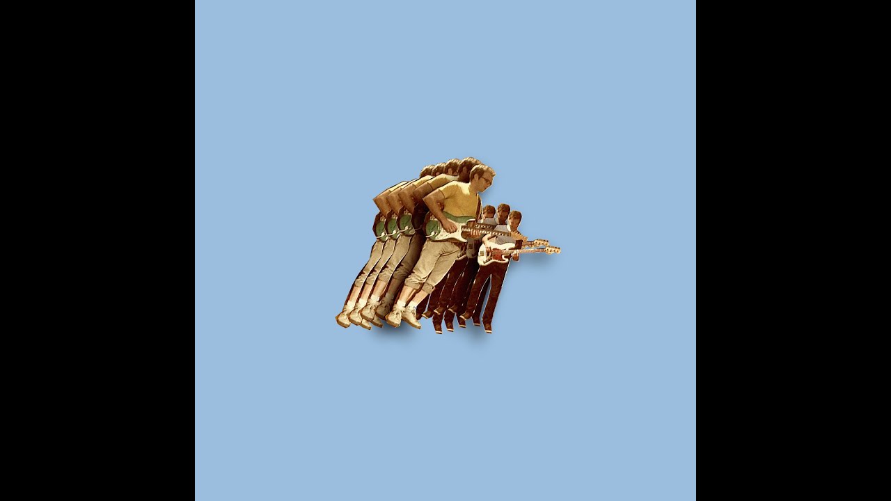
This artwork is for the album Fugue State, released in 2014. The solid colour background is indicative of the indie nature of the band's music while the amateurishly cut-and-pasted band members are more typical and expected of funk music.
We think that we would use the solid colour background on our digipak as it appears on almost every Vulfpeck album cover.


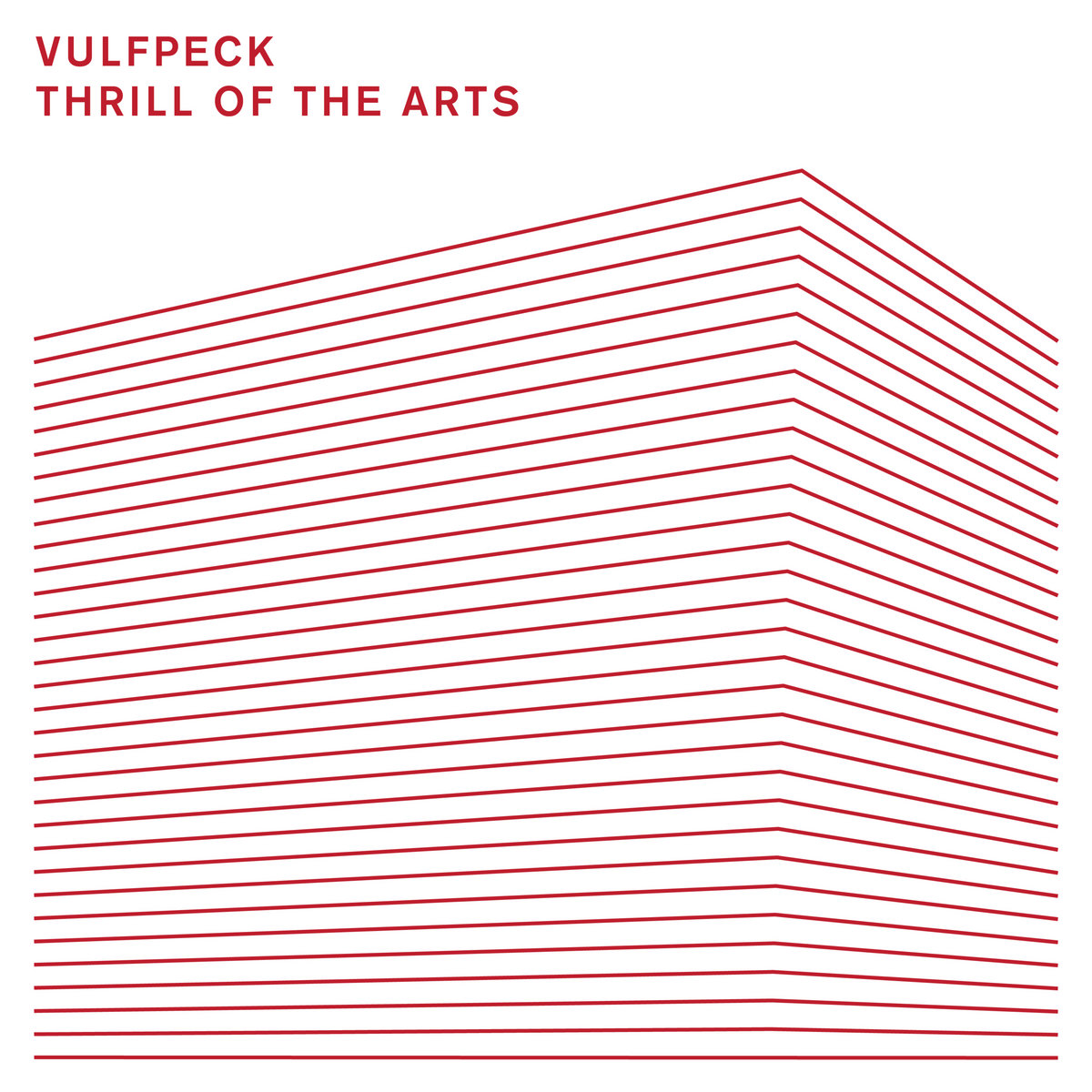
Our digipak artwork would most likely have a white background, as that is the most often used colour on their album covers. However, we don't think we'll use the cut-and-pasted image on the front, as the band has started to move away from that art style with their newest album, Thrill Of The Arts(bottom left of the pictures above). This artwork is a signature of the band, though, so it is not certain whether we will use it or not.
We think that we would use the solid colour background on our digipak as it appears on almost every Vulfpeck album cover.


Our digipak artwork would most likely have a white background, as that is the most often used colour on their album covers. However, we don't think we'll use the cut-and-pasted image on the front, as the band has started to move away from that art style with their newest album, Thrill Of The Arts(bottom left of the pictures above). This artwork is a signature of the band, though, so it is not certain whether we will use it or not.

No comments:
Post a Comment