Tuesday 15 December 2015

Storyboard


Location Shots

This will be the main character's bedroom.

This is where the main character will eat his breakfast, only to be disrupted by the pile of clothes.

This room would be where the main character brushes his teeth before once again being distracted by the pile of clothes.

This is the mirror in which the main character will try on his different outfits.

We chose to have the video take place in a house, as it reflected the indie genre of the song and artist. Vulfpeck also very often film their music videos in their houses too.

Tuesday 8 December 2015

Digipak 1

This is the our very first mock-up of the digipak. It was heavily influenced by Vulfpeck's album cover art and just about every aspect of the digipak was made in their style.


The solid background colour was decided upon, as we felt that having multiple overlapping colours and imagery wouldn't necessarily fit the indie-funk genre. The colour of the background is #9bbede. This is the exact same colour of the background for the artwork of the song Christmas In L.A. as well as the album Fugue State.


Christmas In L.A. artwork

Fugue State artwork

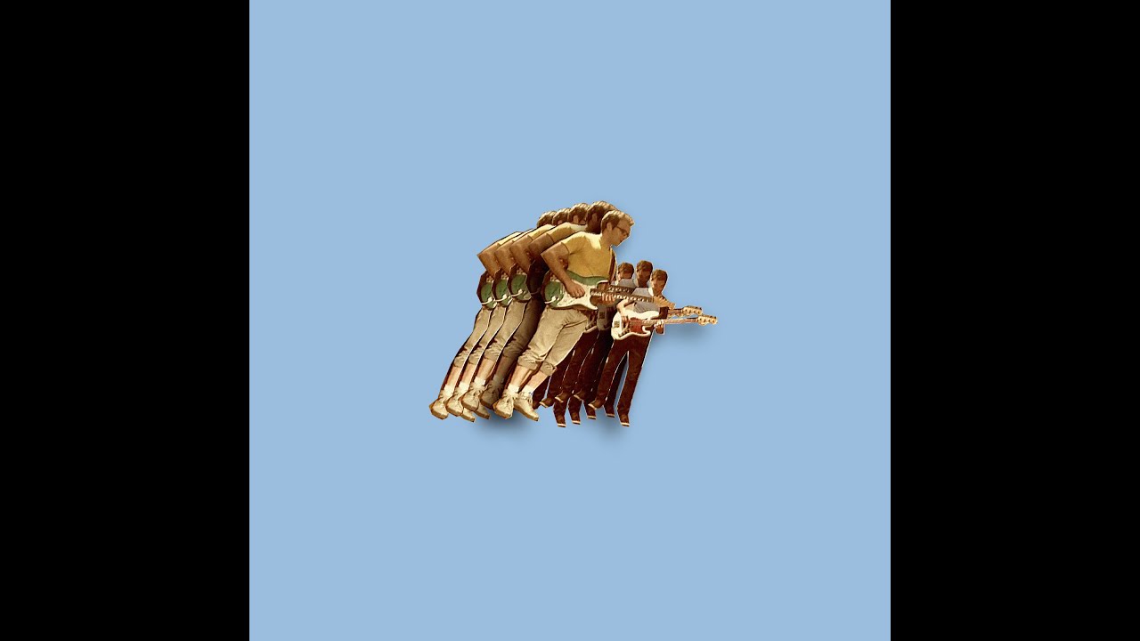
Our digipak mock-up also has a picture of a bass guitar that has been cut-and-pasted three times, dropping shadows onto the ones beneath them. This is seen on nearly all of Vulfpeck's albums.
The fonts we used were an attempt to recreate the fonts that are used on other Vulfpeck albums. However, we feel that in trying to recreate this, we have limited ourselves in terms of making an effective funk digipak. This is because the font we ended up using doesn't look like the Vulfpeck font and also doesn't even look remotely funky. To fix this when making the final design, I think we should replace the bland font we chose with something a bit bubblier and funkier. However, whether this will fit with the simplistic style of the rest of the digipak remains to be seen.


These are examples of the fonts we were trying to recreate.

Creating a Digipak

Funk music uses a variety of colours. Neon and bright colours are commonly used as well as dark pink and purple, used to be suggestive of a sexual nature, usually reflected in the music video. An excellent example artist is Snarky Puppy. A group composed of lots of musicians, they perform different genres, but usually delve into funk and similar genres. They use lots of soft colours, and happy imagery. This is common for funk musicians as it distinguishes themselves from other genres. The simple cover is also common, as to show that they don't need distractions from the music.


Cover for Snarky Puppy - We like it here
Album cover for Prince
Prince, a world renown artist also uses simplistic album covers to sell his music. The theme of love is usually apparent, usually being the main focus of the cover. This cover isn't as explicit as others, although does contain Prince topless. The colour scheme is similar to Vulfpeck's, as is the simplistic style.
We decided to approach our digipak in a similar way to that of Vulfpeck's "Fugue state" song. We decided, as Vulfpeck use bright colours we would do the same.


We picked this colour, a light sky blue, as Vulfpeck did for 'Fugue State'. We noticed that their song/album covers are relatively simplistic, yet effective in portraying the artists. We went with this approach, seeking to create a simplistic album, representative of Vulfpeck's and we stuck with the same colour conventions. We edited a guitar into the the picture and duplicated it, similar to how Vulfpeck duplicated two of their musicians to the same effect.


Funk music tend to use curly writing for their font that is displayed with their music.On album covers, posters and more, curly writing is a very common sight for funk music. We decided to try different fonts to see whether they would fit better with our digipak, which we then decided that no other font seemed to fit better. After testing other fonts, we applied a curved font, similar to that of funk convention. As for the colour of the font, we decided to use a colour that stood out. We first suggested black, as to stand out from the background. But ultimately decided to go with orange, as it fit in with the colour scheme and code of funk music.


Thursday 3 December 2015

Props

For our A2 Media video, we are going to use alot of visuals to tell a story, such as lighting, costume and props. The use of props will be relatively minimalist, however each prop used will be unique, and mean something. Alternatively we discussed having lots of props, which would tie in to the visual element of funk music, as well as the alternative style. We decided not to have too many props, as it would distract from the main focus of the video.

Props we have considered:

Toothbrush + Toothpaste

We want to incorporate this prop to show the average life the protagonist/s has, before the change in lifestyle dramatically occurs. This simple pair of props add to the minimalist look of our video, as not to draw attention away from the costumes.


Calendar
The calendar is a key prop in our video, as it initially alerts the character to then start trying on different clothes. The calendar will be featured in the video at various points to signify the time is going by. This is key, as we will not have any dialogue in the video.


Breakfast
Again, this prop is to show the regular life style the character. This will work well with the upbeat, fast music as the prop will not distract from the story, but it will add to the 'normal' lifestyle the video starts with.


Clock
The clock is key in our music video to show time going by. It is crucial to the plot, as it is to show the progression and how the dead line is growing ever closer. Alternatively, the calendar could be used for this, or possibly a wrist watch, but as a group we agreed that the clock would be more effective, and would complement the use of the calendar as well.


Risk Assessments

Risk: Camera running out of battery
Resolution: Bring extra batteries. and make sure camera is charged before filming to avoid initial problem.

Risk: Actor absent
Resolution: Work on other shots in the time as we need to still be productive, reschedule the shot.

Risk: Bad weather
Resolution: Work on inside shots, most shots will take place indoors so this should not be a major problem. Reschedule to another day when the weather is better.

Risk: Not enough filming time
Resolution: We will plan correctly, sort out all planning before hand and make sure we have enough time to film.

Risk: Copyright issues
Resolution: Contact the artists, make sure everything is fine. Write a statement to say that the content is not ours, and it is owned by Vulfpeck.

Initial Digipak Ideas 25/11/15 - 01/12/15

Because our chosen band is Vulfpeck, we have chosen to make our digipak design closer to and influenced by the designs of Vulfpeck's own album covers.
This artwork is for the album Fugue State, released in 2014. The solid colour background is indicative of the indie nature of the band's music while the amateurishly cut-and-pasted band members are more typical and expected of funk music.
We think that we would use the solid colour background on our digipak as it appears on almost every Vulfpeck album cover.


Our digipak artwork would most likely have a white background, as that is the most often used colour on their album covers. However, we don't think we'll use the cut-and-pasted image on the front, as the band has started to move away from that art style with their newest album, Thrill Of The Arts(bottom left of the pictures above). This artwork is a signature of the band, though, so it is not certain whether we will use it or not.