Monday 4 April 2016

Evaluation Question 1

In what ways does your media product use, develop, or challenge forms and conventions of real media products?


In our music video for Vulfpeck's song Adrienne and Adrianne, we conformed to and challenged many conventions of real funk music videos. These included:

The Narrative
Most funk music videos tend not to have a clear narrative, and instead focus on performance based videos. This is seen in videos ranging from indie funk videos (Vulfpeck) to professional funk (Mark Ronson ft. Bruno Mars).


Funk artists tend to have performance videos as it reinforces their musical credibility and proves that they can play their instruments or sing. For our video, we thought it would be better if we didn't take ourselves as seriously and instead made a video with a comical, ridiculous narrative. We felt this would be better, as Vulfpeck don't need to reinforce their musical credibility because they are an indie band. This means that proving that they can play their instruments isn't important because they're making music for entertainment. A much larger artist, such as Bruno Mars or Mark Ronson, might receive criticism if it appeared that they weren't playing their instruments or singing their own songs.
Adrienne and Adrianne is an indie funk song. Indie funk tends not to be dance music like traditional funk. This worked in our favour, as it meant that a solely narrative video wouldn't seem out of place. This is because narratives are becoming more common in indie funk music videos. For example, Thundercat's Them Changes is a narrative based video.


The Visuals
The visuals were something we both conformed to and challenged. Funk videos normally tend to have bright colours, and these bright colours are normally contrasted with solid blacks from things such as lights being off. Both bright colours and solid blacks are seen in the video for Michael Jackson's Don't Stop Til You Get Enough.


In this video there is a contrast between Michaels Jackson's black tuxedo and the bright colours that constantly change in the background. Funk artists use bright colours like this to reflect the genre, which is almost predominantly dance music, so having vivid imagery like this fits well with the audio.


In our video, the bright colours are present at the beginning. However, as the video continues and it gets darker in tone, it also gets darker in terms of visuals.


These screenshots show similar shots at the start and at the end of the video. By the end, the colours are a lot duller and there is less contrast. The colours that the character is wearing are also a lot darker compared to the beginning, going from blues and whites to browns, greys, and blacks. We deliberately chose to have the bright colours disappear throughout the video, because it was supposed to reflect how the narrative got weirder and darker in tone as the character gets tormented by his clothes.

Mise en Scene
This convention ties in with the narrative of our music video. We chose to have the mise en scene in our video reflect the narrative. This meant, because the video revolves around a person in their house, that the house would look like a normal house. To make it just seem like a normal house at the beginning, we would fill each shot with general clutter that someone would find in their house. For example, boxes around the character's room, towels hung up in the bathroom, and notes on the fridge. We could also show the passage of time through the mise en scene, as parts of the background would change when revisited.


These screenshots show the fridge the first time it's seen and the second time it's seen. Clearly the note and magnet have been moved, as well as a new note being added entirely. There are also small changes that reflect the narrative of the video. These are small things we thought we would add, where clothes would be piling up in different shots.


We added different clothes into these shots, like shirts, socks, jumpers, jeans, etc., to reflect the story that the character is getting overwhelmed with items of clothing.
Mise en scene in funk music videos tends to be reflective of the general theme of the video. For example, the mise en scene in Uptown Funk is meant to fit with the quasi-70s theme. This is done through the design of things like neon signs in the background and the car that appears halfway through the video.


In terms of having the mise en scene fit with what's happening in the video, we conformed to that convention in our music video.
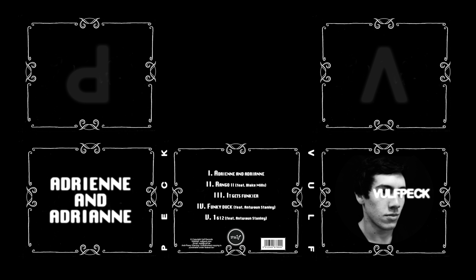
Digipak

Our digipak. 

We also conformed to and challenged conventions of funk digipaks. One convention we challenged was having the music video and album artwork thematically or visually similar. Ours contrast very strongly, as the music video is bright and comical, and the digipak is black and white and appears to take itself quite seriously. This is done as a satire of over-the-top serious album covers, and contrasts heavily with the music itself, which is very upbeat.
Our music video and digipak combination contrasts with a real music video and album combination by an indie funk artist, Thundercat.


The cover for his album, The Beyond / Where the Giants Roam and this screenshot from his video for Them Changes (from the album) are very visually similar. The rest of the video also has dark silhouette imagery similar to the album cover.

The satirical contrast of our digipak and magazine advert challenges conventions of the funk genre, however, the actual satire element is something we feel conforms to the funk genre, as satire is very common in funk.

Evaluation Question 2

How effective is the combination of your main product and ancillary tasks?


For this question we set ourselves objectives to achieve:

- Did our product achieve its purpose?
- Does it engage our target audience?
- Are all our productions linked and do they all show connections?

Did our product achieve its purpose?

The purpose of our product was to be an entertaining music video which engages a funk audience. I think we have achieved this as the way we edited the beats and sounds of the song to the movement in the video which is something typical of a funk music video. This comes across as an appealing part of the video to our target audience. 

We see examples of this at 0:44 in our production. 


The idea of having our character changing in and out of different outfits is something we came up with to create a comical effect and something that may appeal to our audience.


Our music video also achieved it's purpose by appealed to our target by the consistency having fast cuts and a quick tempo throughout the whole video. This form for editing is often appealing to a young audience, which our's is. This allows the video to consistently be moving forward and prevents boredom. It promotes action within a funk genre music video. 

Does it engage our target audience?

I think our music video does engage our target audience through a number of ways. Firstly, the use of quick cuts which move the video along quickly and reduce boredom. This certainly engaged our audience. To add to this our cuts are timed to the music and as in the example I previously showed, at 0:44 seconds in the video we see this. This creates a large sense of fluidity and consistency throughout the video. Fluidity is something common to funk videos. We therefore edited our video in this way as we knew it would be engaging to a funk audience and therefore our target audience. 'Atomic Dog' by George Clinton is an example of a popular funk music video which follows the same codes of fluidity and editing. The music beats to the visuals within the video. Atomic Dog is a video that managed to successfully engage their audience. We know this through the success of the song and from looking at how many people have viewed the video (6,600,000). By using similar techniques in our own video, we can be sure of engaging our target audience which is also people who enjoy the funk genre.


Our audience will also be predominately young people from the ages of around 14 to 18. A stereotype of people within this age group is that they hate to get out of bed in the morning. This, as well as a stereotype, we know to also be true. To engage our audience further, we made our lead role a teenage male who, at the beginning of our video we see to be lazily getting out of bed as he has been woken up by the alarm. We had our actor, Jason, portray this by rubbing his eyes and clearly showing the emotion of tiredness. This works to engage our audience by giving them something to relate to as the video start. The relative character instantly draws them in and develops a sense of interest.


- Are all our productions linked and do they all show connections?

Our digipak and magazine advert are certainly connected. We designed them both to go together and some sort of continuation of each other. We see how our digipak shows a band members head and the magazine advert features the body. This creates an almost urgency to own both the digipak and magazine advert so the viewer can place one above the other and see the full person. This idea first came to us from looking and books and how authors have used the same techniques and producing book spines. Readers buy them all to then be able to place them next to each other and see the continuation.

We see a good example of this here with the full Harry Potter book collecting and how once each book is placed next to each other and in the correct order, an image is formed. 

Our digipak and magazine advert are connected though the same idea. They support one another and promote the album across a wider range, as once seen the magazine advert, the same person would recognise the the digipak and link it to the same band. Pushing the name and image of 'Vulfpeck' that much further with both the digipak and magazine advert working together with a strong connection.

                          Head on front of digipak (bottom right)

                                    Body on magazine advert 

Our video doesn't link as clearly to the digipak and magazine advert as the magazine advert does to the digipak. In fact we actually went with an almost directly opposite appearance. Both our digipak and magazine advert look quite dark and serious. Both edited and published in black and white and a serious, emotionless expression on the face of the band member on the digipak and the same for the body language on the magazine advert. Despite this, our music video is, firstly with a different band member, in colour and portrays an upbeat and almost comical atmosphere. We created this huge juxtaposition between our product and ancillary texts to break the convention of all three being closely linked. Our video is almost a joke when looking at how serious our digipak and magazine advert are. We have created this juxtaposition also to almost give two brand images within a single brand. The dark and serious side and then also the relaxed, jokey side. The dark and serious side, as shown in our digipak and magazine advert, is there to portray the band as serious musicians who are into the music they play and work hard to create top content. Many people respect this and think musicians should focus their energy and attention on the music they create. On the other hand however, many people feel this is a very arrogant and self centred approach, as if the musicians are pretentious. This is way we also created the relaxed, jokey side which shows how the band aren't self centred and don't take themselves too seriously. They create fun music for themselves and other people to dance to. This also creates an unexpected surprise as after looking at the digipak and magazine advert, most viewers were likely to be expecting a dark serious music video to go along with the convention we have been working with so far. I think this builds the video and makes it even better, as an upbeat video that appeals to our target audience is always going to be a good thing, but even more now that it came as a surprise. This makes the combination of our main product and ancillary text very effective.

Evaluation Question 3

What have you learned from your audience feedback?


Our audience feedback consisted of asking a total of 5 questions to 4 respondents who were in the same age group as us. Considering that our video was targeted to a younger demographic, getting feedback from people who were around our age was predetermined. 

Our questions:
  • What can you tell me about the narrative of the music video?
For the most part, the respondents seemed to roughly understand what was going on in the video. They all managed to get that it was about a guy facing the pressures of a fashion show and that somehow he managed to get on more clothes as time went on. Although, the character's motivation seemed to be a bit lost. One respondent missed out the fashion show completely in their answer, so, whilst the majority of people seemed to understand what was happening, the narrative perhaps wasn't clear enough. However, this is less of a concern for the chosen genre, as funk videos tend to be incomprehensible or difficult to understand. Due to this, I believe we have succeeded in accurately capturing the funk genre.

  • Did the actor's characterisation help the overall style of the video?
The intent behind Jason's characterisation was to have a character that suited the tone of the music video perfectly. 


The reaction to Jason's character was positive all round. One respondent stated that he felt that he was a relatable character, given how lazy he's presented in the video. This was an objective of ours as we wanted to make Jason's character seem like the everyday man. Another response was that it aided the flow and theme of the video which was imperative as it would have been a disaster to have a character that slowed the pace down, especially since it's a funk music video. The over-the-top gesturing and facial expressions made by the character also fit with the over-the-top and comedic narrative and visuals. From the audience's responses, we can tell that we achieved in creating the character, and subsequently the atmosphere, that we wanted.

  • Did the digipak and magazine advert work well together with the music video?
We thought it'd be rather ironic to present a clear distinction between the music video, digipak & magazine advert. By that we mean that both the magazine advert and digipak are monochromatic and rather plain, a total contrast to the vibrant images in our music video. This juxtaposition was created in order to stray away from the normal conventions of having a similar matching digipak, magazine advert and music video, as well as poke fun at comically serious magazine adverts and digipaks produced by other artists.


It came at no surprise then that the reactions we got from the question were fairly mixed. One reaction we had said that it added more layers to the project and made it more interesting, whilst another said that the digipak and advert were dark, a contrast to the lively and upbeat tone of the music video. However, none of the responses seemed to catch onto the way we were poking fun at other artists, which is a bit of a drawback we should have anticipated.

  • Did the music match the style of the video?
One the whole, the responses to this question were fairly positive. Most of the respondents felt that the tone of the music matched the tone of the video rather well, stating that the upbeat nature of the video complimented the track. We were glad to hear these responses as we were actively trying to fit the music with the video.

However, one response didn't seem to agree. This respondent said that at times, the song overwhelmed the video which is a fairly made point. Our video is small in scale. It's set in the confines of a house and features one character. The song, however, is ostentatious, loud and wuite dramatic. It's only natural that some people may have felt that the modest and self contained nature of the video suffered because of this.  

  • Did the video look professional?
The last question we asked was if the video looked professional. The last thing we wanted was to have a video that labeled amateur. Luckily, the responses we received were positive.

The editing seemed to receive the most praise, with respondents saying that it was smooth and how they appreciated the transitions from scene to scene. Editing is a big part of funk music videos. When done right, it helps the video match the track, thus creating a far more enjoyable visual display as well as reflecting the dance nature of funk. This was certainly a goal of ours, we wanted people to enjoy the video as much as they did the track.

Evaluation Question 4

How did you use media technologies in the construction and research, planning, and evaluation stages?

The different media technologies we used in these stages include:
  • Final Cut Pro 7

  • Final Cut Pro 10
  • YouTube


Before production started, we decided that for our planning stage we create an animated storyboard by adding frames from the storyboard and putting them in time with the music in Final Cut Pro 7. The storyboard let us picture the on-beat cuts that we were going to use in our production to fit with the music.


During post-production, we looked at the intro to the video, where the character sprints towards the calendar (0:34 in the video). We decided to speed up this shot to make it seem more comical. In Final Cut Pro 10 we sped up the shot to about 150% speed which made the run look obviously sped up for comedic purpose. This decision was made to separate this video from reality, as this is done throughout almost the whole video.


Another thing we noticed during post-production was that the opening shots seemed eerily silent. The solution for this was to add diegetic sounds of birds chirping (from 0:00 to 0:27) to make the scene sound more alive. We got the sound clip from a YouTube video which we then put on YouTube-mp3.org to make it into an audio file. 

We also added the sound of an iPhone alarm from 0:03 to 0:14. This was done the same way: through YouTube-mp3.org.
We also had to get the sound of birds chirping fade out as the music faded in. Final Cut Pro 10 let us do that, as you can change how long the audio fades out for (e.g. end instantly or fade out over a long time).


Another example of diegetic sound used in our video was at 1:48 where the character screams. This was the only sound recorded with the camera that we kept. While editing, we thought that the scream was too loud and stood out too much in the video. At first, we tried removing the scream, but this felt weird, as the character looked like he was screaming but no sound was being made. We all believed that the absence of diegetic sound seemed strange and the character's obvious discomfort should be accompanied by the scream. Ultimately, we decided to lower the volume of the scream significantly so it wouldn't drown out the song.


This screenshot shows the audio of the scream clip. Final Cut Pro 10 allowed us to isolate certain audio in each clip and then change the volume of said audio. The isolated audio on the right is the scream, which we have lowered to considerably lower than it was when first recorded.

During editing, we wanted to have the image of the calendar overlay during a montage scene. The overlay fades in and out to show the passage of time. This shot starts from 1:10 and ends at 1:26. The shot of the calendar appears 3 times, very briefly. In Final Cut Pro 10 we were able to add keyframes to create a path that the overlaid clip could travel along, making it slide across the screen.

The line going through the middle of the screenshot is the path of the calendar clip. We did this with all three clips of the calendar.


Adrienne and Adrianne, the song used for our music video, is 3:52. However, during editing we cut down parts of the song, subtly removing part of the song so that it would fit the length of our video. 

This screenshot shows how we removed part of the chorus of the song, and fit the end of the song on. This let us end the video when we wanted, as the song was too long.

For our evaluation, we used Final Cut Pro 10 once more to edit our audience response video. The music we added to it is royalty free music we downloaded from the website incompetech.com. This website had hundreds of free to download, royalty free songs we could use, so we took a song from there.


All throughout nearly every blog post, research, planning, and evaluation, we have included screenshots. This is made possible by Macs, the computers we were using in class. On a mac, you are able to take screenshots using a keyboard shortcut: shift+command+4. This small bit of technology let us add screenshots of what were writing about into almost every post.


These images show what it looks like when taking a screenshot of a whole window (top) and when taking a screenshot of a specific thing by clicking and dragging (bottom)

Breakdown of a level 4 evaluation

http://alstonjay.blogspot.co.uk/


This is a link to a media blog that received a level 4 (19 out of 20 marks) for the evaluation. It's received almost full marks because it followed the mark scheme incredibly closely.


Josh has effectively used digital technology and ICT in his evaluation. This is seen through the use of screenshots, digital annotations making links between his ancillary tasks and examples of real life ones, prezi presentations, and an audience feedback video.

Screenshots from video

Annotated ancillary tasks

Prezi presentation

In terms of these parts of the mark scheme, Josh has shown a very clear understanding of each aspect. He writes a significant amount on how his video conforms and doesn't conform to different conventions of hip hop music videos, even bringing in media theory to expand his points. He also has various videos and screenshots from different stages of production, explaining what he was doing during these stages, pre and post. His understanding of audience feedback was clearly shown, as he has included an audience feedback video and analysis of how his audience feedback has helped shape the final product of the video (i.e. adding an epilepsy warning to the start of the video).

Josh clearly got a lot of marks for this part of the mark scheme. This is because he has crafted his evaluation in a way that makes the information much easier to understand. He has done this through the use of annotated screenshots, videos, and prezi presentations. All of these things make reading the evaluation a much easier task than if it was all written up paragraph after paragraph. It also looks far more professional in this form. This is also reflected in the final part of the mark scheme, "ability to communicate".

Thursday 25 February 2016

Magazine Advert Changes


Since the first draft, we've added a lot more information to the advert. We started by adding reviews, which we felt would make the album more enticing, especially if they were high reviews. At the bottom of the advert we put the record logo and the website of the band. Adding this kind of information seemed like a necessity to us, as we saw it on other magazine adverts.

At the bottom right corner, we put the logos for different streaming services where the album would be available. This helps make the advert more realistic. We also changed the colours of the logos to black and white, as it fit with the black and white theme we have used throughout.

Tuesday 23 February 2016

Digipak changes


We made a couple minor changes to the digipak design. These include:
  • Resizing the barcode so it didn't take up so much room


  • Removing the "III" from the end of track 3 to make it less confusing

Magazine Advert

Our magazine advert followed a similar theme to the digipak design. This was done by making the subject black and white, and overlaying the artist's name and the album name in the same font as they are on the digipak. 

We also decided to have the main focus of the magazine advert be a person's body. This links with the digipak, in which the focus is a person's head.

We also put the digipak on the front. However, this might look quite out of place so it might be changed later in the advert development.