Tuesday, 8 March 2016
Thursday, 25 February 2016
Magazine Advert Changes

Since the first draft, we've added a lot more information to the advert. We started by adding reviews, which we felt would make the album more enticing, especially if they were high reviews. At the bottom of the advert we put the record logo and the website of the band. Adding this kind of information seemed like a necessity to us, as we saw it on other magazine adverts.
At the bottom right corner, we put the logos for different streaming services where the album would be available. This helps make the advert more realistic. We also changed the colours of the logos to black and white, as it fit with the black and white theme we have used throughout.
Tuesday, 23 February 2016
Digipak changes
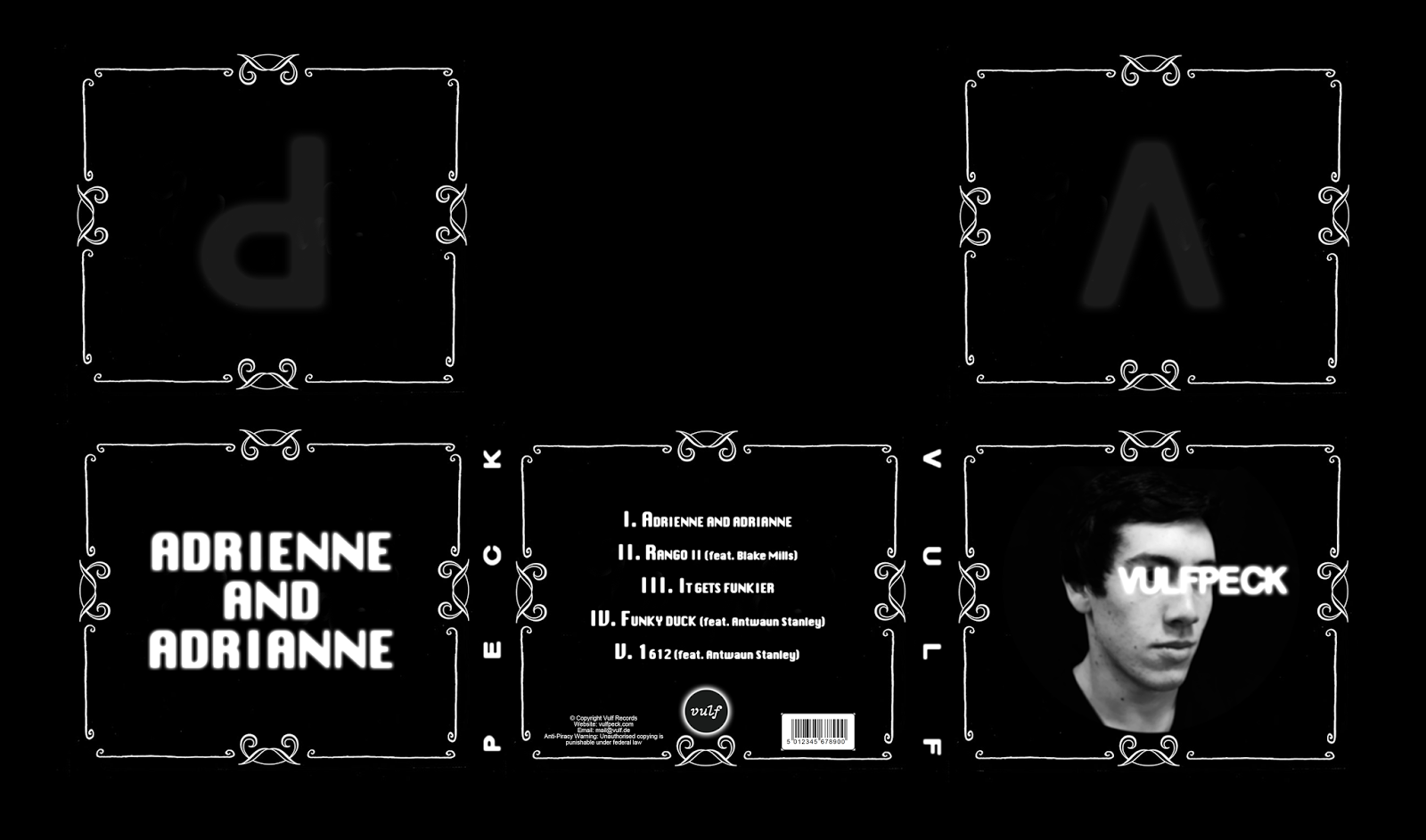
We made a couple minor changes to the digipak design. These include:
- Resizing the barcode so it didn't take up so much room

- Removing the "III" from the end of track 3 to make it less confusing

Magazine Advert

Our magazine advert followed a similar theme to the digipak design. This was done by making the subject black and white, and overlaying the artist's name and the album name in the same font as they are on the digipak.
We also decided to have the main focus of the magazine advert be a person's body. This links with the digipak, in which the focus is a person's head.
We also put the digipak on the front. However, this might look quite out of place so it might be changed later in the advert development.
Filming changes
With the original mirror we were supposed to film, we found it difficult to shoot without either getting the camera in the shot or without getting enough of the subject in the shot.
To combat these problems we have chosen to shoot with a different mirror that we can angle.


To combat these problems we have chosen to shoot with a different mirror that we can angle.

This is what our actor sees when looking into the mirror.

And this is what our camera sees. Using a mirror we can angle lets us film our subject without getting the camera in the shot.
Thursday, 28 January 2016
Analysing a Magazine Advert
For our magazine advert, we would like to apply a simplistic style, with not a lot of images/text. This would work well as Vulfpeck use simplistic style.
For example, Lana Del Rey's cover is simple, minimalistic and straight to the point.

- Artist is centered, main focus of the cover. This tells the audience the musician doesn't need distractions from the music and is right to the point
- Light colours keep the theme happy
- Small font underneath to not take up space
- Large white font to highlight the artists name and help it stand out on the blue background
- Blue font on the white shirt, contrasting white title with blue sky
- Not a lot of excess imagery and clutter to fill up the cover and distract the consumer
- Simple colour scheme, not too complex and hard on the eyes
As a group, we decided that a simplistic magazine advert would be best, as unnecessary clutter would distract from the content. Similar to our digipak, there will be 'Vulfpeck' written in bold capital letters.

- Cover is simple, but has complex lighting/colours
- Colours are warm, shades of pink, red and orange
- Text at the top is large, bold and white.
- Text is recognisable as La roux's font as she uses this text for her other album/covers
- Only one image used, no clutter and random objects in the cover
- Cover uses the artist to sell the album
- Colours are not too intense, so not too deter the consumers
- Colours are used to set the theme/tone, as La Roux uses intimate themes in some of her songs
Similarly, La Roux has used a simplistic style with a lot of depth to it. Which is what our cover is attempting to achieve. We will use techniques that the people who designed La Roux and Lana Del Rey's advert and apply these to our own magazine advert.
Subscribe to:
Posts (Atom)