Tuesday, 15 December 2015
Location Shots
This will be the main character's bedroom.
This is where the main character will eat his breakfast, only to be disrupted by the pile of clothes.
This room would be where the main character brushes his teeth before once again being distracted by the pile of clothes.
This is the mirror in which the main character will try on his different outfits.
We chose to have the video take place in a house, as it reflected the indie genre of the song and artist. Vulfpeck also very often film their music videos in their houses too.
Tuesday, 8 December 2015
Digipak 1
This is the our very first mock-up of the digipak. It was heavily influenced by Vulfpeck's album cover art and just about every aspect of the digipak was made in their style.
Christmas In L.A. artwork
Fugue State artwork
Our digipak mock-up also has a picture of a bass guitar that has been cut-and-pasted three times, dropping shadows onto the ones beneath them. This is seen on nearly all of Vulfpeck's albums.
The fonts we used were an attempt to recreate the fonts that are used on other Vulfpeck albums. However, we feel that in trying to recreate this, we have limited ourselves in terms of making an effective funk digipak. This is because the font we ended up using doesn't look like the Vulfpeck font and also doesn't even look remotely funky. To fix this when making the final design, I think we should replace the bland font we chose with something a bit bubblier and funkier. However, whether this will fit with the simplistic style of the rest of the digipak remains to be seen.
These are examples of the fonts we were trying to recreate.
Creating a Digipak
Funk music uses a variety of colours. Neon and bright colours are commonly used as well as dark pink and purple, used to be suggestive of a sexual nature, usually reflected in the music video. An excellent example artist is Snarky Puppy. A group composed of lots of musicians, they perform different genres, but usually delve into funk and similar genres. They use lots of soft colours, and happy imagery. This is common for funk musicians as it distinguishes themselves from other genres. The simple cover is also common, as to show that they don't need distractions from the music.
Cover for Snarky Puppy - We like it here |
Album cover for Prince |
We decided to approach our digipak in a similar way to that of Vulfpeck's "Fugue state" song. We decided, as Vulfpeck use bright colours we would do the same.
We picked this colour, a light sky blue, as Vulfpeck did for 'Fugue State'. We noticed that their song/album covers are relatively simplistic, yet effective in portraying the artists. We went with this approach, seeking to create a simplistic album, representative of Vulfpeck's and we stuck with the same colour conventions. We edited a guitar into the the picture and duplicated it, similar to how Vulfpeck duplicated two of their musicians to the same effect.
Funk music tend to use curly writing for their font that is displayed with their music.On album covers, posters and more, curly writing is a very common sight for funk music. We decided to try different fonts to see whether they would fit better with our digipak, which we then decided that no other font seemed to fit better. After testing other fonts, we applied a curved font, similar to that of funk convention. As for the colour of the font, we decided to use a colour that stood out. We first suggested black, as to stand out from the background. But ultimately decided to go with orange, as it fit in with the colour scheme and code of funk music.
Thursday, 3 December 2015
Props
For our A2 Media video, we are going to use alot of visuals to tell a story, such as lighting, costume and props. The use of props will be relatively minimalist, however each prop used will be unique, and mean something. Alternatively we discussed having lots of props, which would tie in to the visual element of funk music, as well as the alternative style. We decided not to have too many props, as it would distract from the main focus of the video.
Props we have considered:
Toothbrush + Toothpaste
We want to incorporate this prop to show the average life the protagonist/s has, before the change in lifestyle dramatically occurs. This simple pair of props add to the minimalist look of our video, as not to draw attention away from the costumes.
Calendar
The calendar is a key prop in our video, as it initially alerts the character to then start trying on different clothes. The calendar will be featured in the video at various points to signify the time is going by. This is key, as we will not have any dialogue in the video.
Breakfast
Again, this prop is to show the regular life style the character. This will work well with the upbeat, fast music as the prop will not distract from the story, but it will add to the 'normal' lifestyle the video starts with.
Clock
The clock is key in our music video to show time going by. It is crucial to the plot, as it is to show the progression and how the dead line is growing ever closer. Alternatively, the calendar could be used for this, or possibly a wrist watch, but as a group we agreed that the clock would be more effective, and would complement the use of the calendar as well.
Risk Assessments
Risk: Camera running out of battery
Resolution: Bring extra batteries. and make sure camera is charged before filming to avoid initial problem.
Risk: Actor absent
Resolution: Work on other shots in the time as we need to still be productive, reschedule the shot.
Risk: Bad weather
Resolution: Work on inside shots, most shots will take place indoors so this should not be a major problem. Reschedule to another day when the weather is better.
Risk: Not enough filming time
Resolution: We will plan correctly, sort out all planning before hand and make sure we have enough time to film.
Risk: Copyright issues
Resolution: Contact the artists, make sure everything is fine. Write a statement to say that the content is not ours, and it is owned by Vulfpeck.
Initial Digipak Ideas 25/11/15 - 01/12/15
Because our chosen band is Vulfpeck, we have chosen to make our digipak design closer to and influenced by the designs of Vulfpeck's own album covers.
This artwork is for the album Fugue State, released in 2014. The solid colour background is indicative of the indie nature of the band's music while the amateurishly cut-and-pasted band members are more typical and expected of funk music.
We think that we would use the solid colour background on our digipak as it appears on almost every Vulfpeck album cover.
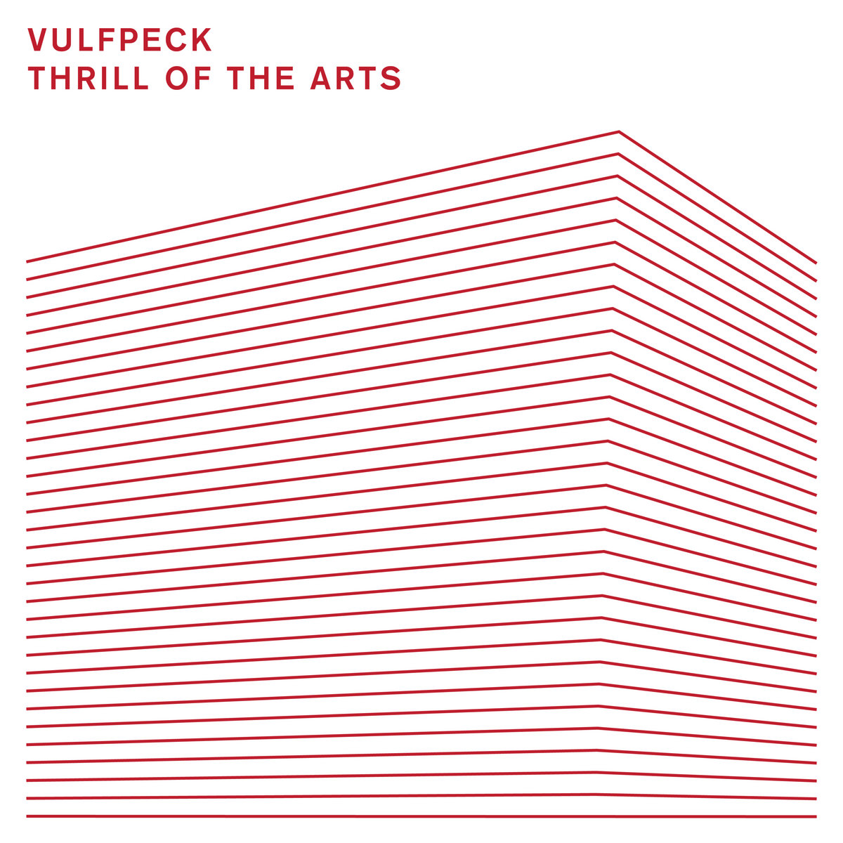
Our digipak artwork would most likely have a white background, as that is the most often used colour on their album covers. However, we don't think we'll use the cut-and-pasted image on the front, as the band has started to move away from that art style with their newest album, Thrill Of The Arts(bottom left of the pictures above). This artwork is a signature of the band, though, so it is not certain whether we will use it or not.
Tuesday, 24 November 2015
Costume design
In our video, the main character of the piece will definitely wear a fur coat at some point.
A fur coat was suggested when we first came up with the final idea. The thinking behind this is that, since fur coats are a rare sighting, it would play on the unorthodox nature of our video. This, in turn, makes our video a far more interesting and unconventional piece, catering to the funk genre.
We always briefly discussed the idea of wearing multiple layers, serving as another mechanism that will aid in dwelling on the uncustomary themes running throughout the piece.
Our plan is to have our main character wear lots of clothing all at once. This would be funny and ridiculous, which is a common theme in many funk videos.
By the end of our video, the main character will be seen wearing a lot of clothes. These clothes will be whatever we can find and so, are too random to find examples to post. We looked at the scene in Friends where Joey annoys Chandler by wearing his clothes but without pants or boxers. Here, he is seen to be covered in layers of multicoloured clothes, wearing many t-shirts, joggers, shorts and ties. The clothes we use will also vary in size, much like what Joey is wearing, as they are clearly not all one size.
This picture of the same character is another example of what our main character may end up looking like. This picture is closer to what the actual final result may look like as the first pictures clearly show a costume that has been designed, whereas this picture looks closer to what it would look like to actually be wearing six sweaters.
Since there is only one character in our production, and they are going to be wearing a multitude of random clothing, it is difficult to find sufficient examples.
Thursday, 19 November 2015
Funk Digipaks - Album Covers
This funk album cover shows a comically large LED sign late at night. This is similar to a lot of older funk music videos, which often take place late at night, or in dark areas, with comically shaped and sized LED signs. A good example of this is the music video for George Clinton's Atomic Dog. This video takes place in a dark arcade with lots of ridiculous LED lettering and shapes plastered all around the room. The font is also a very typical funk font, as well as the "INC" at the bottom, which is a bubble font. Bubble fonts are very common in funk albums. This album was released in 1971.
The design of this cover is more typical of what people expect from funk: bright colours (colours used for funk art are almost always some shade of yellow, red, pink, and orange) wavy lines, and typical funk outfits with things like star-shaped sunglasses. It also helps that the cover is all cartoon, as funk videos (especially jazz-funk) often include animated elements. By having the artwork entirely hand-drawn, Funkadelic were able to get the band member's onto the album cover, without using real life elements, like photos. George Clinton's Atomic Dog is also an example of animated elements in music videos, as there are animated dogs appearing throughout the entirety of the video. Also the font used for the band name, "Funkadelic", is a bubble font. This album was released in 1981.
This album art is from 2011 but is a throwback to older, classic funk and soul designs. It even has fold creases on it as though it's an old poster or album cover from back in the 70s. The design is similar to the previous two images, as it has a very dark background with red, pink, orange, and yellow lines. These identify it as a funk album. The fonts used for "funk" and "classics" are bubble fonts too, which also fits in with the conventions. The font used for "soul" is also reflective of vintage soul album covers. However, this artwork is very minimalistic, which is a more modern design choice, which indicates that this album is not in fact classic and vintage, but is modern. The album was released in 2011.
Mark Ronson's Uptown Funk has a much more modern design than the others. The lack of colour, aside from the yellow box of names at the top left, is an indication of this change from classic to modern funk album covers. However, the minimalism is still an indication that this is indeed a funk album. It's a lot more minimalist than other ones, like the Ministry of Sound one, but the roundness of the artwork and the polka dots in the middle are easily identifiable as funk conventions. This album was released in 2015.
Ideas for Our Music Video (19/11/15)
We've recently gotten a steadicam shoulder rig for the camera that we're planning to use. We're also planning to use a glide cam if it is available. These would allow us to pull of the "single-take" effect we had discussed, if we do end up going with that idea.
An idea that one of us had is that we go to Shotover (a local woods), and at different beats someone pops out from behind a tree. Those people would be a variation of the same character, so that by the end of the video there would be multiple versions of the same person dancing to the music.
Another idea we had is that someone gradually gets more clothes on him whilst we watch him walk. On different beats a new item of clothing appears on him. It was suggested that we purposely incorporate continuity errors, as this would add comedic effect. It would also reflect the amateur look of many of Vulfpeck's videos.
FINAL IDEA:
Expanding on the clothes idea, we thought we would have the main character planning for a fashion show or something else circled on a calendar. The video would show the character planning his outfits for the show as well as his normal daily routine. As the song continues and the big day gets closer and closer the character's outfits and daily routines get more and more ridiculous. By the end of the video, the character will be wearing a ridiculous amount of clothes only to find out he was using last year's calendar.
We feel that this ridiculous idea would reflect the comical nature of many funk videos, while also being original in its own way. It follows a narrative that makes little sense too, like many funk music videos.
Thursday, 12 November 2015
Ideas for Our Music Video (12/11/15)
One idea that was discussed was the idea that our video would consist of one long take. That a day of our main character would be documented. There were talks of the world around this character being abnormal and strange, but the character would be totally oblivious to this and simply carry on. These abnormal and strange visuals happening within the world would be quite typical of funk music videos, with there being bright colours and abstract shapes.
The technical side of making a video that appears to be one single take would prove to be quite difficult. We discussed the idea that we make the special effects look amateur, in a similar vein to Vulfpeck videos. However, we decided that making a single-take effect look amateur would look quite bad and just wouldn't work.
The idea of a character walking down the street was lifted from the music video forBittersweet Symphony by The Verve.
Another contrasting idea was that we'd follow the main character around in his/her house whilst they carried out mundane activities such as brushing their teeth, making breakfast and eventually falling asleep. However, we felt this might be just a bit too mundane and were thinking about how we could make it more interesting.
A working class idea was briefly touched upon. Due to the upbeat nature of the song, a couple of members in the group discussed the idea of following a member of the working class, living in evident impoverished conditions. The message of it would be the plight of the working/lower class as the video would portray the hardships but not dwell on them. Instead, the person would embrace the lifestyle towards the end in an attempt to portray the humanity of the working class, as opposed to how they're normally represented in the media. The upbeat nature of the song would also contrast with the message of the video. However, this idea was scrapped as we felt it didn't accurately represent the funk genre.
A video we want to take inspiration from is Them Changes by Thundercat. The video offers a lot of symbolism, matching an upbeat track with comically dark tones and scenes. The contrast between the song and violence works very well here as, whilst the song is certainly a funky one, it isn't too upbeat that it detracts from the story that the video is showing. With ours also being a funk track, we want to see how many dark scenes we could possibly incorporate within our video. However, our song is far more lighthearted than this. It'd be interesting to see how far we could actually go with a dark narrative without making it feel gimmicky or too out of place and unfitting.
Another suggestion offered, one that contrasts completely to our last idea, was the idea of making a parody. Vulfpeck are quite comedic in their music videos; the idea was that, with our own, we could take that comedic element and really dwell on it to the point of making a parody of one of our other ideas.
We know that we want our video to look amateurish, similar to Vulfpeck's music videos, to fit in with the indie funk nature of the song. Vulfpeck often opt with a performance shot based music video, however, we want ours to be abstract with at least some form of narrative. This is also due to the fact that none of us play an instrument.
Thursday, 5 November 2015
Analysis of BBFC Rating
We believe that the BBFC video rating for our music video will be rated 12.
We think this is so as during the duration of our video none of the below will be included, which would make it above a 12.
- Drug misuse
- Dangerous behavior presented as safe
- Bad language
- Sexual behavior and nudity
- Threatening behavior and violence
The age rating 12 is simple. It means that we think any persons under the age of 12 can not legally buy a copy of the video in a shop or online.
Wednesday, 4 November 2015
Digipak Evolution
Digipak's are utilised to help establish and promote the brand of which an artist uses to gain revenue. The digipak will consist of a front cover, back cover, where the CD sits, the inside centre and left. Each of these panels have certain roles to play.
The front cover is the main part of the pack. The main image of the pack will be on the front cover, along with the album name and artist's. This aids the brand of the artist. Whoever listens to said artist will immediately identify with the brand on the front cover, whether its a picture of the artist or a logo affiliated with said artist.
The back cover is where the tracking list is usually placed. The design, colour scheme and text found on the front cover often remains there on the back, this continuity again aids to advertise the brand of the artist and album. The text has to jump of the page so that the customer feels intrigued to read it and buy it.
The extra panel is the third part which is seen, it should show an image in the background and maybe a little bit of writing from either one of the producers or artist's as to how the album was brought together or what the meaning is.
The inside left and right cover could consist of multiple different things. Usually, the centre panel has a pocket for the lyric book. A lyric book helps the consumer familiarise themselves with the tracks which in turn, grows the fan base for said artist as the song then becomes more widely known.
The inside right cover is where the disk will sit. This part doesn't require much editing at all. A few digipak's print an image underneath where the CD sits. More often than not, they'll avoid doing this and choose to place a picture onto the CD.
Our main goal with our digipak will be to ultimately sell the brand of our music video/artists. This will be done through the colour schemes, font and the design of the cover which will look appropriate to the funk genre.
Magazine Covers for Music
The magazine cover shows Michael Jackson, who was at the time an active member of the band 'The Jackson 5'. The band had taken the global charts by storm, this explains the lack of an explanation as to who Michael is on the cover.
The page is taken almost completely up by Michael, with small text in the bottom left. Several titles on the side and a large 'Record Mirror' as the header. Having Michael as the cover, along with the lack of text implies that particular issue is solely focusing on Michael. The red background helps Michael's colourless photo stand out, an effective tool utilised to help garner the consumers attention.
The title 'Rolling Stone' is red, similar to the text on the magazine. The red is bright and bold, grabbing the viewers attention. The magazine being cluttered and full of information is a design choice, which, as a result, makes customers want to purchase the magazine as they believe there will be a rich variety of content. The focus is on Prince, however, as the title on the left further enhances this. Having the only image as prince with 'Faith! Funk! Sex!' and 'Prince On Fire!' aids to perpetuate Prince's band by labeling him with valued traits. Prince breaking the fourth wall and staring right into the camera adds a certain intimacy with the piece, it suddenly seems so much more personal than the average magazine.
This cover has more going on than the last two. Daft Punk are clearly centered, with big yellow text advertising their name. The font and other images such as the stars are incorporated on the cover to reflect the enjoyment one would have reading it as bright colours and stars have connotations of joy and fun. The headlines placed at the side show that, whilst the magazine sole focus is upon Daft Punk, it is not limited to the stories revolving around them. Rather, it shows that the magazine has a varied amount of content, even though it primarily focuses on Daft Punk. This helps to reach a wider audience than being constrained by the sales of only Daft Punk fans. A wider range of content will aid the newspapers' sales as it'll more likely attract far more people.
The blend of colours, the font and the animation of the figure are all quite urban and appeal to a specific demographic of those who are fans of this type of branding. Along with the bold and wide font, the image portrayed is almost psychedelic in its' style. The main image shows an artist, the central point of the issue, in animated form. By veering away from the norm and incorporating this animation, the magazine company are implying that there is a lot more to expect from this issue than normal music magazines. Next to him are various other sub-headers telling you about different acts. This is relatively simplistic compared to a gossip magazine, for example 'Ok!' magazine.The large pink title reinforces themes of Sex, Lust and Soul, Jazz and funk are often affiliated with these labels and so, the magazine is subconsciously categories by the consumer who stumbles upon it.
'SONIK' magazine has a black and white picture of Marvin Gaye with blue text surrounding him. This is a very plain and simple colour scheme, emphasising the laid-back vibe that the magazine has set out to portray. So, although there are a lot of things to read, the colour scheme presents an almost minimalist cover. The large title of 'Marvin Gaye' is to catch the consumer's eye. Having him look at the sky suggests a journey that he's gone through/is going through. Fans of Gaye would instantly be aroused by such a cover.
Thursday, 8 October 2015
Tuesday, 6 October 2015
Research and Planning
Audience mood board
Our genre of music video is funk so this mood board is made for and directed at a funk music audience.
What is funk?
Funk is a music genre that originated in the mid- to late 1960s when African American musicians created a rhythmic, danceable new form of music through a mixture of soul music, jazz, and rhythm and blues (R&B).
Our audience for the music video are people who enjoy to listen to funk music and enjoy watching a very visual music video. I say visuals to mean that our video will have many things going on; dialogue, motion and a story or narrative also.
Such as in the music video for "Atomic Dog" by George Clinton.
This leaves me feeling that the audience of our music video will be active people who enjoy to dance in and out of clubs or just whenever listening to music they enjoy, such as funk. This is why we will try to create a lively, energetic atmosphere while shooting and recording our video.
Target Audience + Questionnaire
Our target audience is males, aged 17-20 who dislike pop music. As a group, we believe that a questionnaire/survey would be an effective way of gather information. We will create the survey with the purpose to learn listening habits and to better understand how to create our video effectively.
With questionnaires, we can start to see patterns which we can then apply to our music video. Having as much information about our chosen genre means we can fully understand the creation process.
Our questions are:
How often do you listen to funk music?
[ ] All the time
[ ] Sometimes
[ ] I don't listen to it, but i like it
[ ] Not at all
What type of video do you like to watch?
[ ] Story-driven
[ ] Song irrelevant to video
[ ] Centered on band members/singer
[ ] Location shot typed video
[ ] Other, list below
_____________________________
_____________________________
_____________________________
What genre do you like the most? (Add genre on the bottom if ticked 'Other')
[ ] Pop
[ ] Hip-Hop
[ ] R&B
[ ] Funk
[ ] Rock
[ ] Indie
[ ] Other
___________________________
How old are you?
_____
Male/Female?
[ ] Male
[ ] Female
[ ] Other
These range of questions give the survey more flexibility as the people doing them are not being asked closed questions. Open questions, such as ones saying "Other" and fill the blanks below, mean that honest answers can be given, whereas closed questions like "Yes" or "No" may not cover all basis as well as adding "Maybe" for example, or "On certain occasions". Open questions gather information more effectively, although harder to compile, as expectedly there will be more qualitative and quantitative information to sort through.
Audience Analysis
The song 'Adrienne and Adrianne' does not contain lyrics and may not appeal to some audiences. Teenage boys and girls, age 16-18 tend to be big fans of pop and indie music. These genres have a typical theme to the videos, such as love. Our video will follow a story, but not entirely clear. Some parts will be abstract which ties in with indie music videos, but contrasts with pop, as pop music tends to have a linear path of storytelling.
The video will more or less be aimed at male and female aged 17-19, whom enjoy indie music, funk and subtle storytelling and interpreting a video based on your own analysis.
People aged 25+ tend to enjoy older music, such as music the liked when they were growing up. Typically, they shy away from modern music as they have missed the integration of different and a more modern blend of music genres into chart music. Funk music was deemed 'pop' music 20-30 years ago. So our video, which is a sub-genre of funk may be effective in attracting listeners who may feel nostalgic from the style.
An effective way of analysing listening habits is by conducting a survey. Surveys are an excellent way to collect data on, for example, how long someone listens to music a day, or what genre/artists. A downside to surveys/questionnaires is that the data may not be correct as a small minority of people do not speak for that gender,age or ethnicity. A survey may gather sufficient qualitative and also quantitive to understand what audience our video and Vulfpeck's song will appeal to.
Understanding our audience is key to creating a succesful video that not only appeals to the correct target audience, but also causes people who wouldn't normally involve themselves with funk, possibly because pop is so huge, to widen their variety of genre listening habits.
Wednesday, 23 September 2015
Codes and conventions of funk music videos
Codes and conventions of funk music videos using Michael Jackson's ''Don't Stop 'Till You Get Enough'' as an example.
The objective of funk music videos are to encourage the audience to dance along with the music, they attempt to accomplish this using many varied methods. More often than not, the video will feature either a long dance sequence or a montage of clips featuring dance sequences. In the case of Don't Stop 'Till You Get Enough, the entire video is of Michael dancing without cuts. Michael attempts to captivate viewers by incorporating a stylised type of dance which is now an iconic dance routine. Special effects are also utilised in many funk videos. The objective with their addition is to provoke a sense of wonder and enjoyment from its audience. Don't Stop 'Till You Get Enough features a moment in which 3 versions of Michael Jackson are dancing in sync. Another similarity between funk videos are the outlandish locations and settings they take place in. This, again, is aimed to create an overwhelming sensation, provoking one to dance along or at the very least, respond to the music video in some positive way. Don't Stop 'Till You Get Enough is a prime of example of this. The ridiculous and rather psychedelic settings are totally of the time and turn the music video into an experience of its own.
Subscribe to:
Posts (Atom)